Marketing & advertising
~
Marketing & advertising ~
Marketing and advertising is an artform I’ve loved even before I knew that’s what it is I love. My whole life I’ve watched commercials, trailers or seen billboards, posters on the side of the road and at the movie theaters and judged them. I would talk about what aspects I liked and what I didn’t and what could’ve been done to make it better. I have a list of my favorite commercials that I know by heart and campaigns that I aspire to.
Moksa Brewing Company
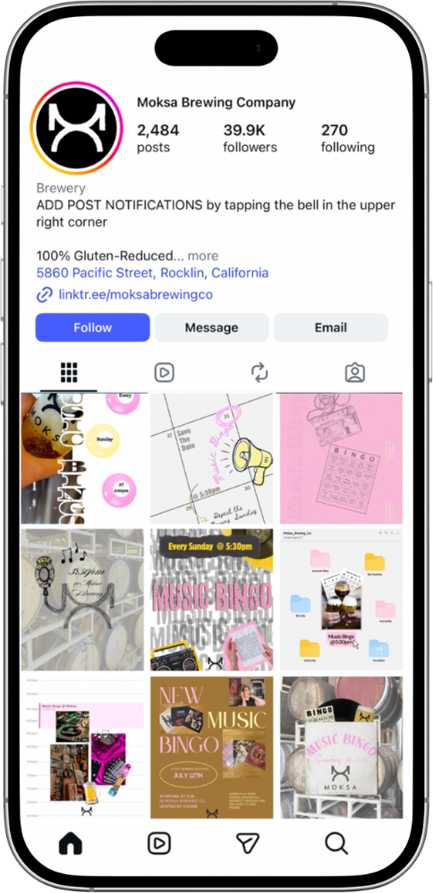
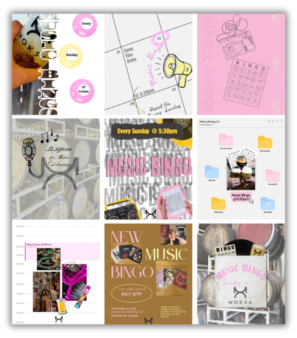
I am running the campaign for the Music Bingo event held weekly at Moksa Brewing. In the first six weeks, sales have increased by over 150% and tips for the night time employees are now matching or succeeding the morning crew.
I chose a pastel pink and butter yellow as my main colors for this campaign for a number of reasons. One, I wanted to use colors that were bright. Many of our posts use dark colors,so using these gives our page contrast and followers recognition. Two, butter yellow symbolizes nostalgia, comfort, and positivity; while pastel pink also gives comfort, it gives relaxation and stability. This event, feeds on nostalgia with most games using songs from the 70’s, 80’s, 90’s and early 2000’s. Music bingo is fun and great way to connect with friends while getting a drink and winding down from the weekend (relaxation and positivity). The fact that this event is held once a week hosted by the same person, someone who also works behind the bar, gives Moksa customers a sense of stability in the event and comfort by knowing the host.
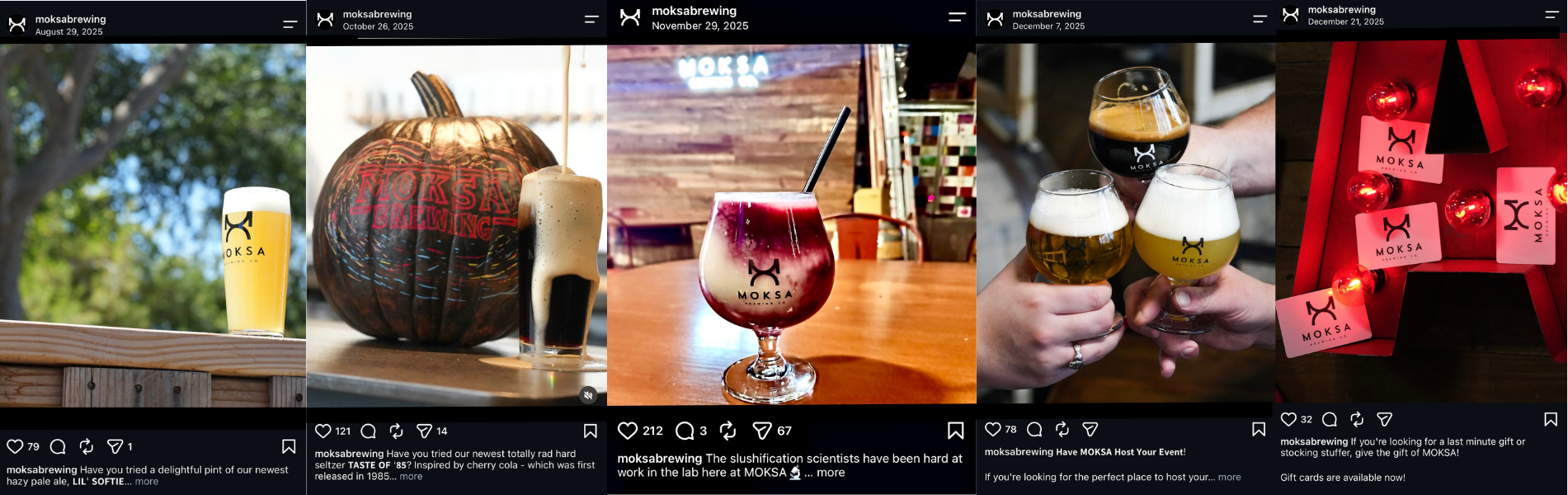
Some of the posts I had a hand in making
Nikki Perez

Nikki Perez is a local artist from Sacramento California. I worked with her to make a larger impact on social media. I curated a monthly posting schedule and brainstorm with her to come up with concepts for content. We decided on a color pallet for her page and what to do to make her page look coherent. In less than a month we had seen a 1100% increase in followers across platforms. The video with the most views is currently sitting at over 270.3k.
For a couple months we decided to focus on red as our primary color on the landing page. During this time, Nikki was being booked for more prominent events, doing interviews, and getting ready to release her first single. We chose this not only because she looks great in red, but to symbolize her courage and passion.
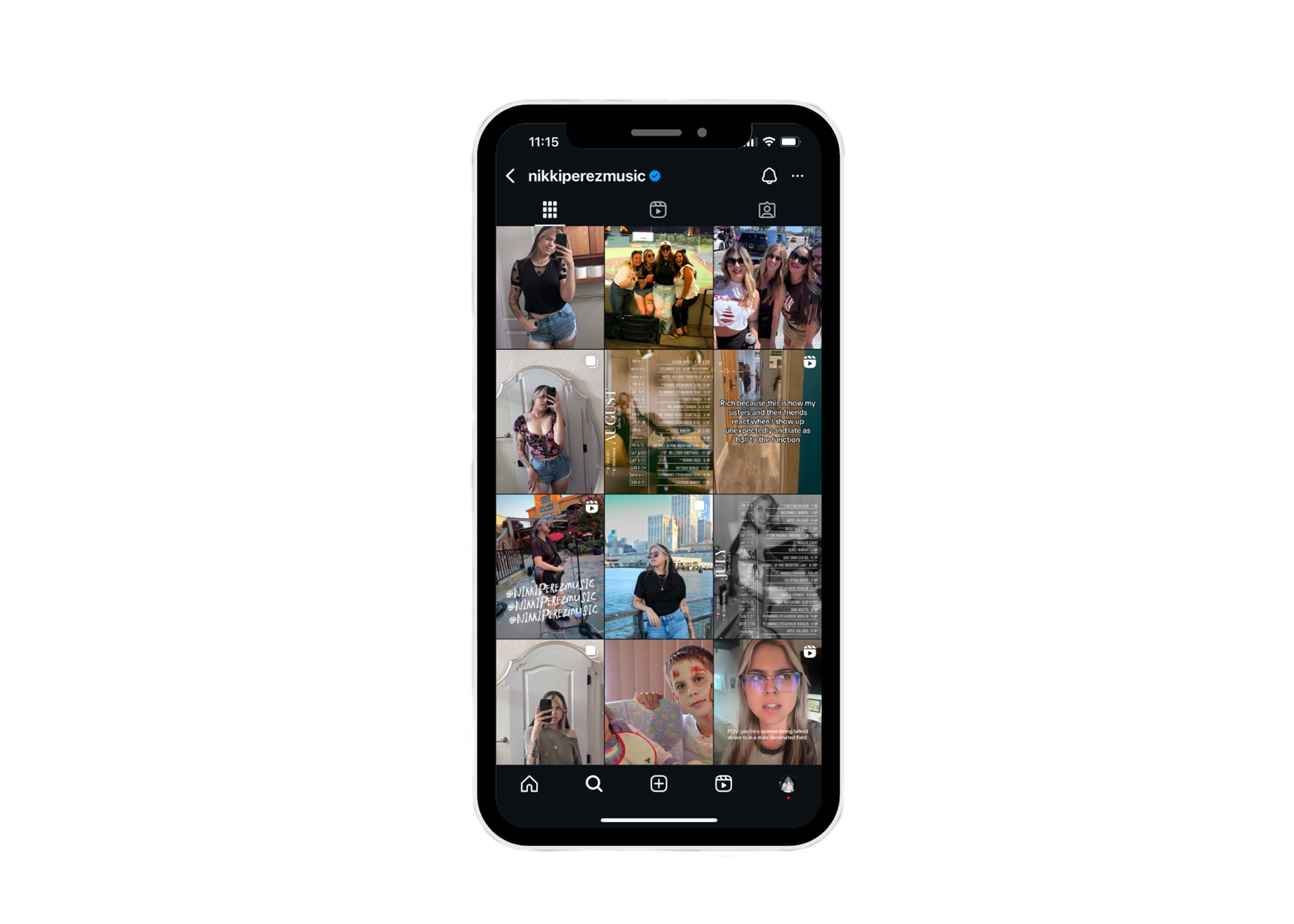
Making a shift
As Nikki decided to take a step back from music, in turn meant taking a step back from socials. In this faze, we moved to using cooler tones, more muted and relaxed to match her more subdue approch.
Personal Projects

The ad campaign for the emmy nominated show “Pam and Tommy” was my favorite campaign in a long time. It made me excited and inspired. I took inspiration from what the team at Hulu had created as well as other designers online to create two ad designs.
I took more of a creative liberty with this one. I kept within VHS theme the team at Hulu used for this campaign, but made it a little brighter. I used a still from the show, cutting out the characters and putting them on a road with the classic LA sunset. For the title I took different 90’s style lettering to spell it out. I then scribbled the show’s slogan on the front of the VHS. This design is meant to look homemade. As if someone did an arts and crafts project to make a VHS sleeve for their home movie.

For this design I wanted it to fit in with the campaign. Like my design could be used for it. Keeping with the VHS theme, I used the concept of film to showcase the characters individually. Using a stack of VHS tapes to display the title, release date, and streamer. I used a warm tone overlay to give the effect of the film being older.
"How I Met Your Father” is a show about a group of friends in their late 20’s early 30’s.When the show came out, it was targeted towards people of that same age, millennials. Something I associate with younger millennials and older gen z, is that mix between technology and nasagia, ie. polaroids, vinyl records, digital cameras that look like film. A device I felt like these characters would have is a polaroid printer.
My Concept for an ad was to take stills from the show: the best friends, the girls, the siblings, the couples, and all of them together. Having those photos as if the main character was printing polaroids of her and her friends.

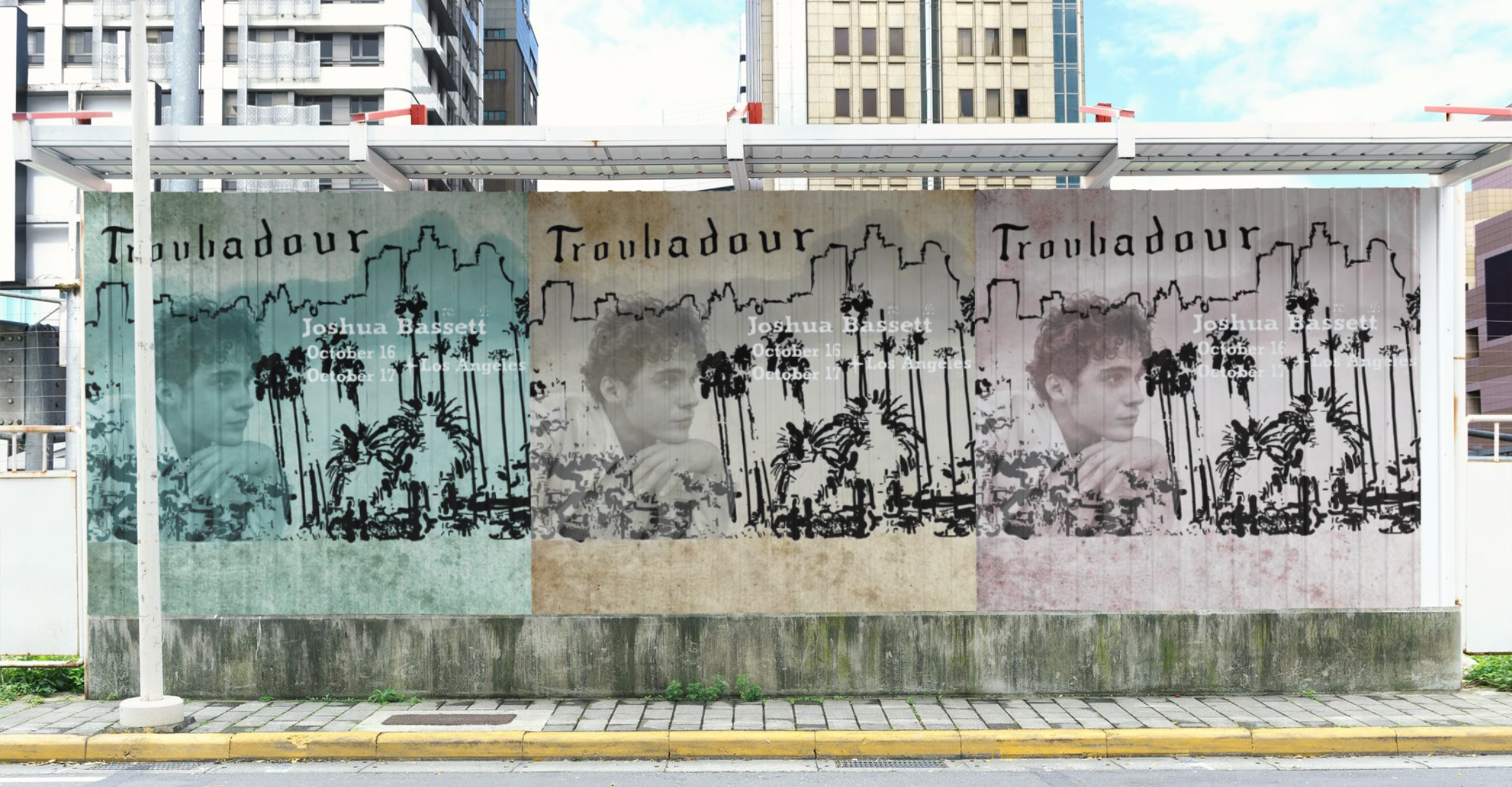
Joshua Bassett is one of my favorite artists. When he played at the Troubadour in Los Angeles during his tour,I was inspired to make a venue specific poster. I wanted to make something rooted in LA. Something that represented the city clearly but also the artistic culture of the city. I used a mix of photo and sketch with an old burnt paper textured background.
I sketched out the Los Angeles skyline with bits and pieces of the valley leading up to the skyscrapers.Most people move to this city with hopes and dreams. I found this photo of Joshua Bassett looking out longingly and knew I had to use that. Of course finishing off the design by puting the venue’s logo and dates of the show.