Visual Identity
I love branding! Helping people and businesses turn their values and traits into something tangible; something easily recognizable that sticks with people.
Cool Beanz Coffee
I was commissioned by this start up coffee company to do a light brand design. This brand is family friendly with a european/ french theme. To me that means elegant, artistic, warm, and inviting.
I pulled the color palette from photos of european streets using the colors of the buildings, roads, and flowers. Staying within soft pastels, muted neutrals, and deep rich shades. I used an elegant yet clear font for the logo and a sophisticated font as a secondary font for packaging, signage, etc.
For this brand I designed a primary, secondary, and submark logo. Using that elegant font, but adding in a whimsy family friendly feel by making the “oo” coffee bean sunglasses.
For the packaging, I sifted through many french patterns to find somethin that fit the brand and could be used in a minimal way. There was too much empty space left on the bag, so I decided to use the coffee bean band mascot on the bag. Mixing the european theme with the family friendly image.
Something this client had to have was this coffee bean band wearing sunglasses. Something fun that the kids will love. I used the brightest, richest color from our palette for the instruments so they really popped. I then used the lighter colors of the palette as accents on the instruments and the shoes on these characters. The band was a non negotiable for the client; by using our color palette, it ties this back to the brand.

Career Direction 4 Me

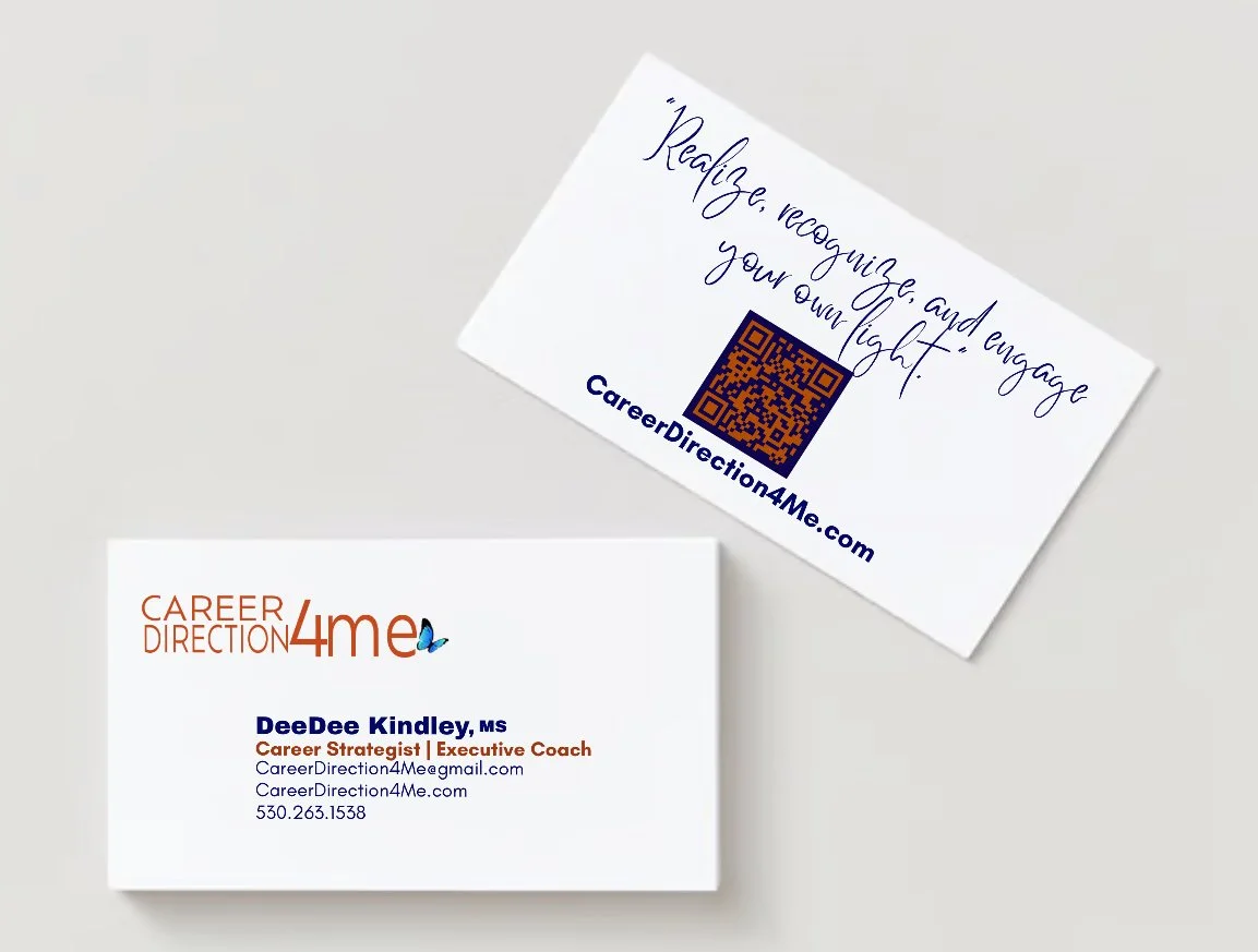
Collaborating with the owner, she wanted her business card to be minimalistic and straight to the point. Using the color pallet, we focussed on using dark blue for the majority of the text while using orange for her title so that both the logo and title are emphasized. We used a clear font for the information on the front of the card while using a personal almost handwritten like font for the business’s mantra on the back. Putting a QR code, in our colors, under the mantra that will take you to the website with the url listed under it in the same font used on the front.

This company's color pallet is deep blue and burnt orange. The owner wanted a clean, easy to read logo incorporating a butterfly. The butterfly represents transformation. We chose to have the butterfly looking as though it’s flying out of the company name because, when using this service you will transform.
Designing a flyer for their workshop, we used hierarchy and two fonts to draw the eye to the most important parts of the event. This way when scanning the flyer it’s easy to find the needed information such as who, when, and where this event is. Using the brand’s color pallet,I put bars in opposite colors and sides in the upper and lower corners around the heading creating some movement at the top of the page. I put “Dream” in the dark blue only to emphasize this event is about making your dream a reality. At the bottom of the page I used color blocks making the place and dates the event will be held readily available and sectioning off quotes about the workshop from people who have previously taken it.
CORSA
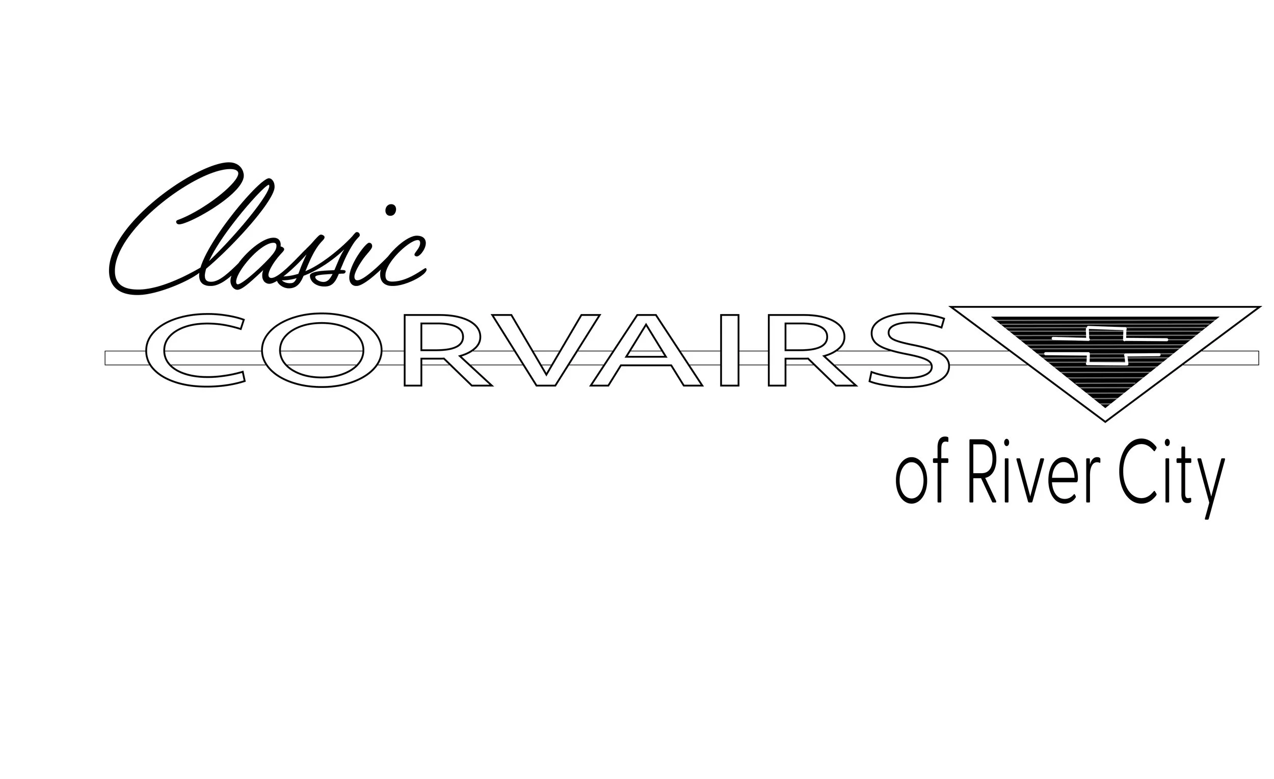
I was commissioned by the board of CORSA, River City chapter to redesign their logo.
For this logo we played with using multiple fonts. The board wanted easy to read, sophisticated, and whimsy. I modeled the center of the logo after the Corvair emblem and using the different types of typography you might find on this classic car for "classic" and "corvairs"
Priscilla’s Coffee House (personal project)
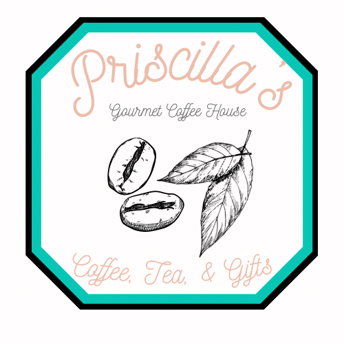
Priscillas was my favorite local coffee shop while living in LA. I wanted to redesign and elevate their logo. I kept the teal color they’ve always had bringing in a soft pink to give contrast while still keeping it playful. While they do sell treats, the main draw is their coffee and tea. They grind coffee beans and tea leaves, so I wanted to bring in sketches of both to the logo, matching the same style of design used on their website creating that through line.
New!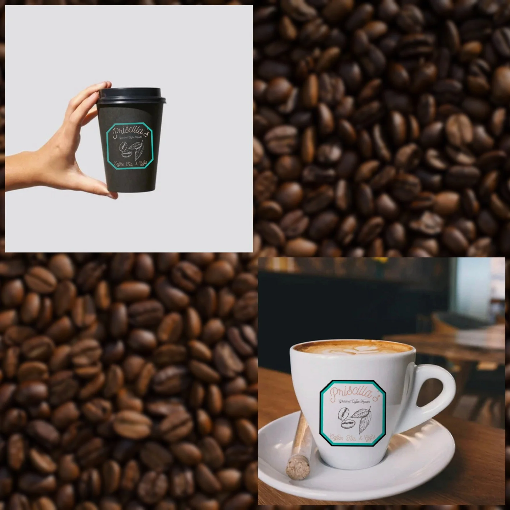
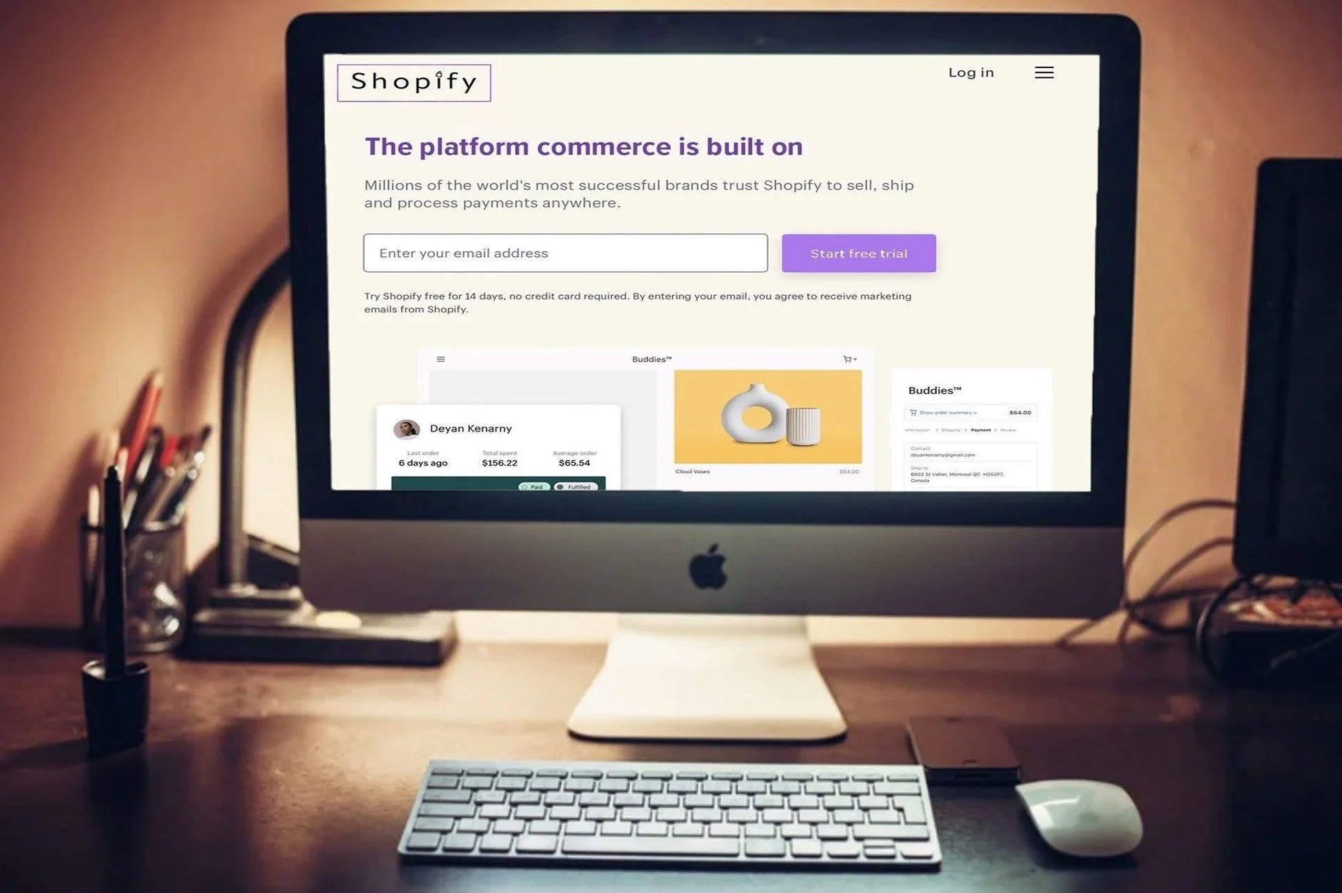
I am not a fan of the current Shopify logo and wanted to redesign it. My thought was to bring the calming purple used in the shop app owned by shopify to create a cohesiveness between the e-commerce’s main website and their app. I modernized the logo making it more pleasing to the eye. I used a purple border keeping with that color, with “Shopify” inside it in a clear font. To top the “i”, I designed a shopping bag. Replacing the bright green on their homepage, I made the button a lighter shade of purple and their header the shade used used in the “Shop” app.