Packaging Design
Doll Packaging
This project came as an assignment from a California State Channel Islands graphic design class. The assignment was to take a woman in history and create the packaging for if this figure was made into a doll. I took Lavinia Fontana. The first professional female painter. I really wanted this packaging to pop, and while it is revolved around someone from the 1500s, the packaging needed to resonate with the youth of today. I used pastels, blues, greens, and pinks. I also wanted the packaging to scream artist. I used a splatter pattern for the insert, then used paint splatter as bullet points and background for the accessories.


Physical Media Packaging
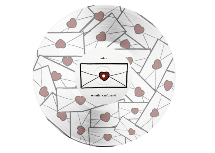
I have been a fan of Sabrina Carpenter’s music since I was 14 years old. I fell in love with emails I can’t send on the first listen through. The advertising for this particular album was very cute, simple, and creative. I just had to jump on, using the theme and create a design. I am a big vinyl person, so designing a vinyl record for an album and artist I love was a fun personal project.
A big symbol used in promotion for this album is an envelope with a red heart seal. I took that envelope with the red heart seal and duplicated many. I layered them over each other at all different angles, then layered that sheet onto a clear vinyl.This photo was taken as some kind of promotion, but I thought it worked well as the cover of the album. Having that symbol of white with a red heart in the middle ties in nicely with the design of the actual vinyl. I love the simplicity and use of neutral colors making the red of the heart and her nails pop.I chose this photo for the back because it keeps with the neutral background like the front, and the one pop of color is red. I used the same color as the door frame for the title. I then took the idea of “emails” and inspiration from the campaign for the album to design a graphic for the track list. Making each song look like an email in your inbox.

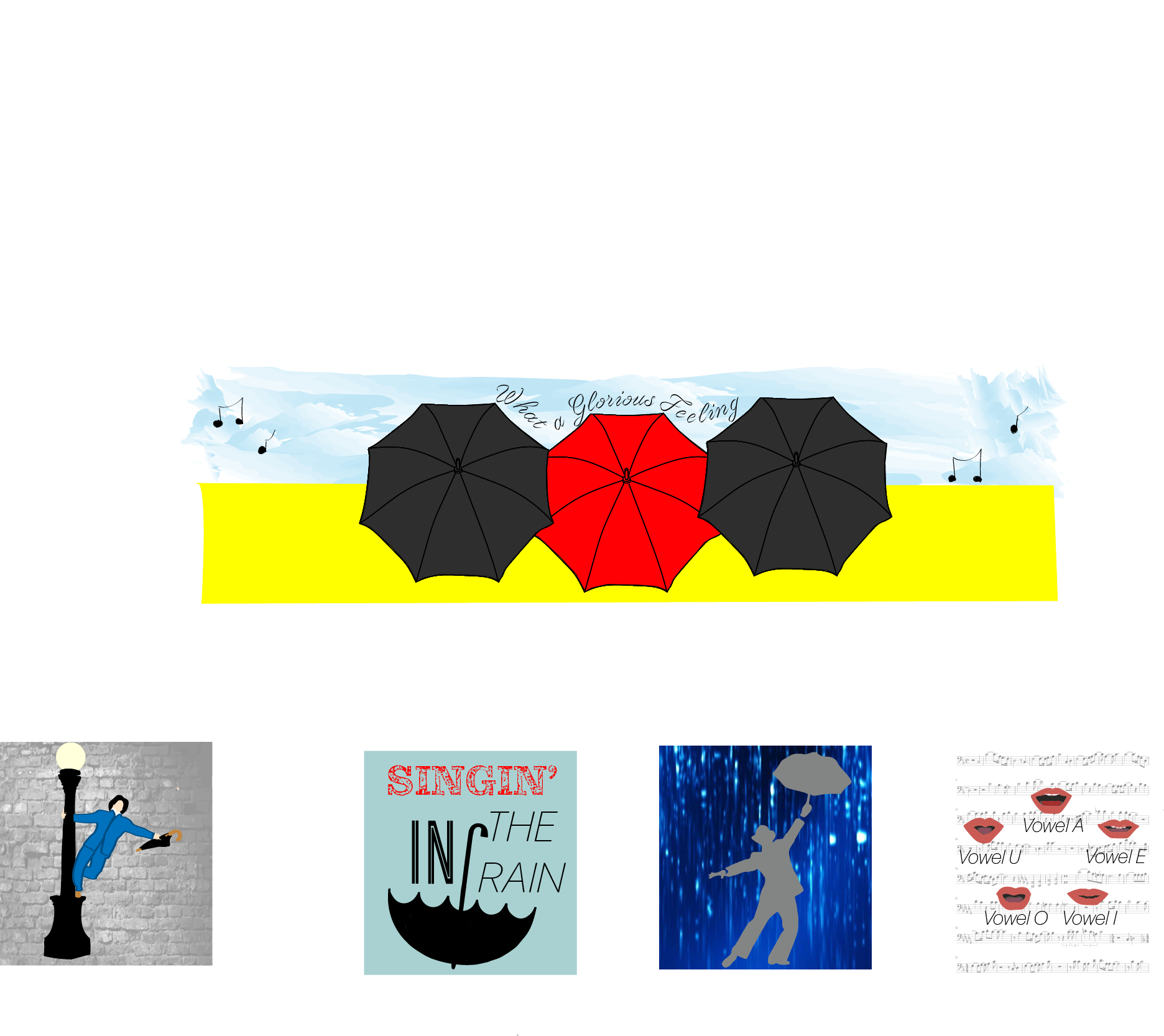
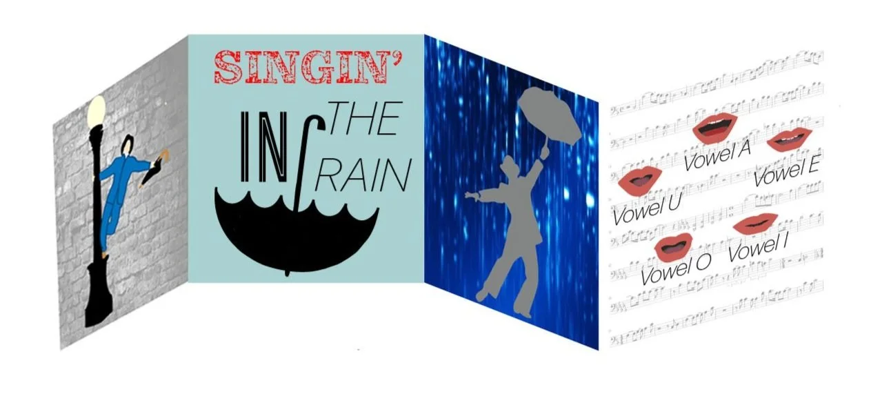
This project comes from an assignment at California State University Channel Islands. The assignment was to create a CD cover for a musical. I chose Singin’ In The Rain because I am a BIG musical person and wanted to do a classic. Singing In The Rain has plenty of iconic symbols I could pull from. This CD cover is a quad fold. I have a through image on the inside and four different designs on the exterior, one on each fold.
For the interior, through design, I did something reminiscent of the movie poster. Using blue at the top, like the movie poster, then using yellow on the bottom symbolizing the yellow rain coats worn. The movie poster has the three leads walking forward, umbrellas open, with Debbie Reynolds in the center with her red umbrella. I decided to have the back of the umbrellas showing, red in the middle, as if they were walking away from the viewer.
For the first fold, I took the iconic image that most associate with Singin’ In The Rain and designed it in a modern fashion. I used minimal detail in the initial man on light post design, with a grayscale brick background symbolizing the brick buildings in the background during the scene in the movie.
For the second fold, I wanted to put the name of the musical. Again keeping the image clean and more modern. I put “Singin’” in red, like the center umbrella on the design on the other side. I used three different fonts just for fun and to put some personality in a very basic design. The blue gray background is used to symbolize the rainy sky.
For the third fold, I used a dark blue background with water pouring down. I chose to have the background more showy/dramatic rather than realistic because these designs are meant to be symbols rather than realistic images. I then put a silhouette of the lead dancing in the rain. Stylistically I wanted to make sure he is facing the opposite way the man on the first fold is. Almost like the first and third fold are showcasing the second fold.
For the fourth and final fold, I really wanted to incorporate a piece of sheet music from the show. I used the sheet music as the background, bringing down the opacity so it’s not the main focus or overpowering the main design. In the movie there is a scene where they hold up cards with the way a mouth looks saying each vowel. I took each of those putting the mouth shapes in a circle and labeling each one.
Beauty Packaging
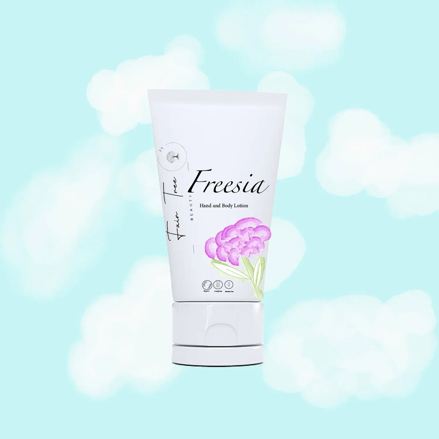
This project started out with me just messing around with different brushes in illustrator. I drew the flower and felt like that was something that would go on a lotion or soap. I landed on mocking up a lotion.
I made up a name for a beauty brand and designed a logo. I got the name for the lotion by searching for bright colored flowers. I then designed a clean beauty label. To me this product was giving a light, spring feel; so, I drew a blue sky with white fluffy clouds as the background for the product.
Beverage Packaging
I thought, what would it look like if “Makers Mark” made a premixed old fashioned. I wanted to keep it clean and classic, like a typical Makers bottle, but with some flair. Since it’s a pre-mixed cocktail, I wanted to bring in some color and make the design almost more childlike to draw in that early 20’s crowd. Not the typical whisky drinking crowd. Hand drawing the notes from the bitters and the ways to enjoy the drink.
