
Cool Beanz Coffee
I was commissioned by this start up coffee company to do a light brand design. This brand is family friendly with a european/ french theme. To me that means elegant, artistic, warm, and inviting.
I pulled the color palette from photos of european streets using the colors of the buildings, roads, and flowers. Staying within soft pastels, muted neutrals, and deep rich shades to signify european. I used an elegant yet clear font for the logo and a sophisticated font as a secondary font for packaging, signage, etc.
For this brand I designed a primary, secondary, and submark logo. Using that elegant font, but adding in a whimsy family friendly feel by making the “oo” coffee bean sunglasses.
For the packaging, I sifted through many french patterns to find somethin that fit the brand and could be used in a minimal way. There was too much empty space left on the bag, so I decided to use this coffee bean band on the bag. Mixing the european theme with the family friendly image.
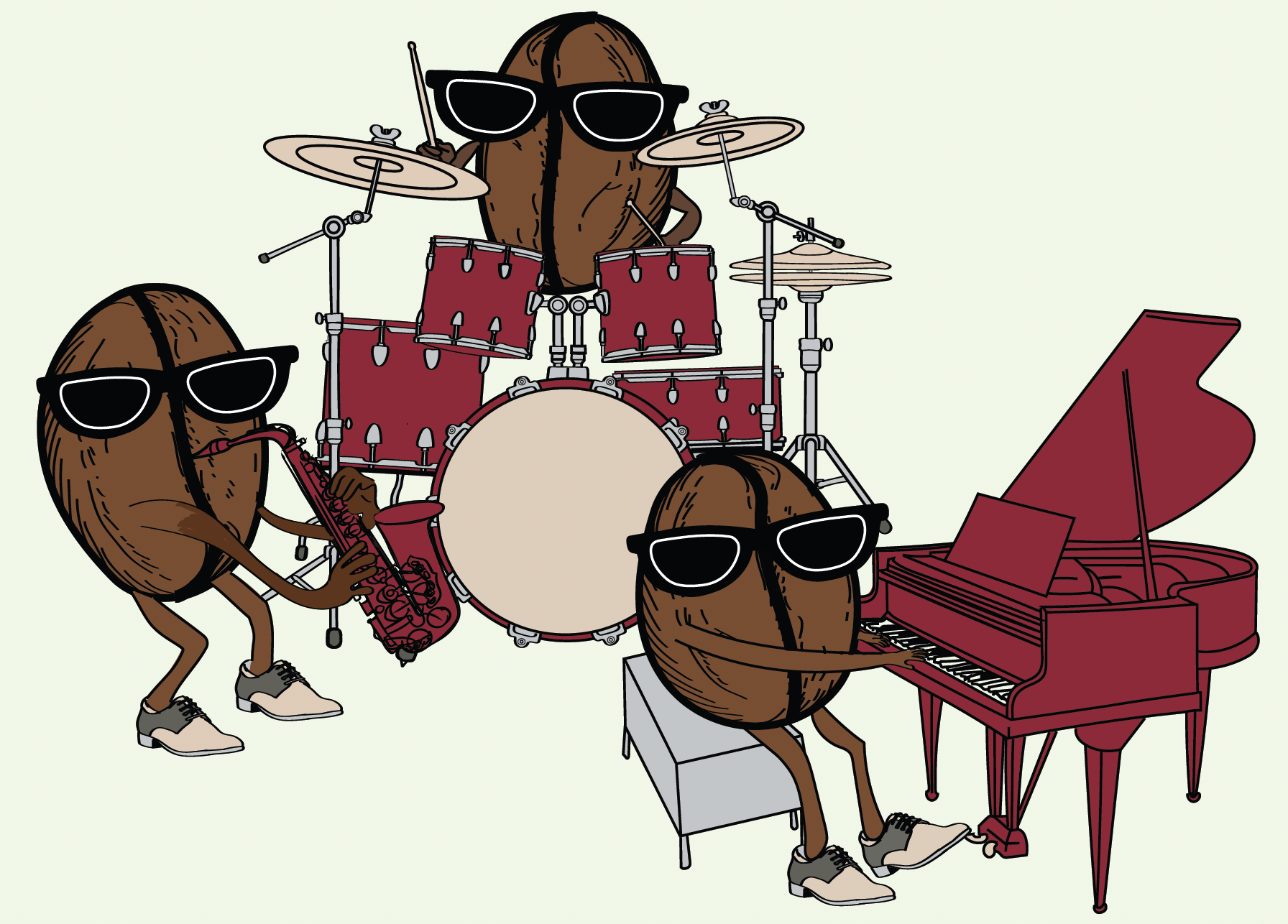
Something this client had to have was this coffee bean band wearing sunglasses. Something fun that the kids will love. I used the brightest, richest color from our palette for the instruments so they really popped. I then used the lighter colors of the palette as accents on the instruments and the shoes on these characters. The band was a non negotiable for the client; by using our color palette, it ties this back to the brand.